Kitchen Colors 2027: New Shades and Combinations That Stand Out
Which kitchen colors will stand out in 2027? From deep natural greens to warm beige and earthy tones, we explore the official Colors of the Year, the latest influences from Italian kitchen design and practical combinations for a contemporary, timeless kitchen.
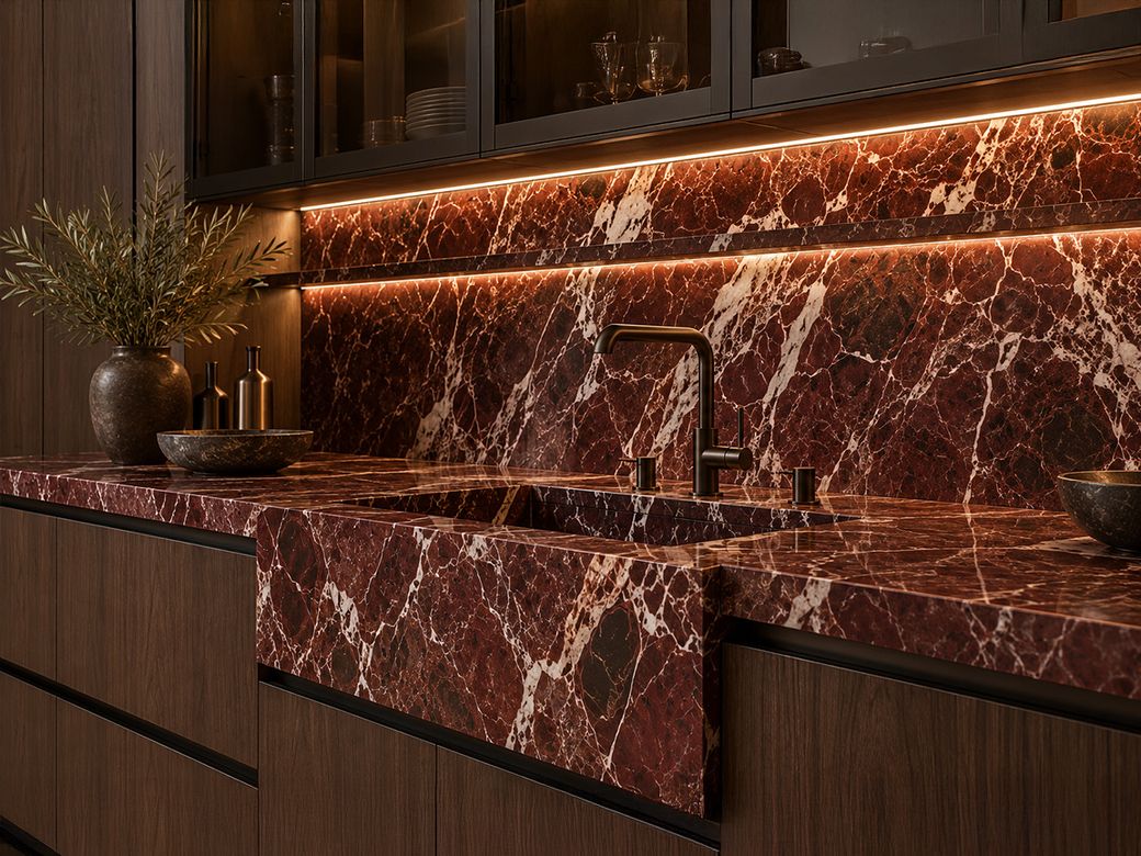
Which kitchen colors are worth considering for 2027? Official announcements from leading paint brands and presentations by Italian kitchen manufacturers point to growing interest in natural greens, warm neutrals and surfaces with distinctive textures.
However, there is an important difference between a color presented as a trend and one that genuinely works in a kitchen.
Let's explore the shades that stand out and, more importantly, how they can be combined with cabinet fronts, worktops and natural materials.
1. Webster Green: Benjamin Moore's 2027 Color of the Year
Benjamin Moore announced Webster Green HC-130 as its 2027 Color of the Year on October 14, 2026.
This classic deep green can create very different impressions depending on the materials and lighting that surround it.
How can it be used in a kitchen?
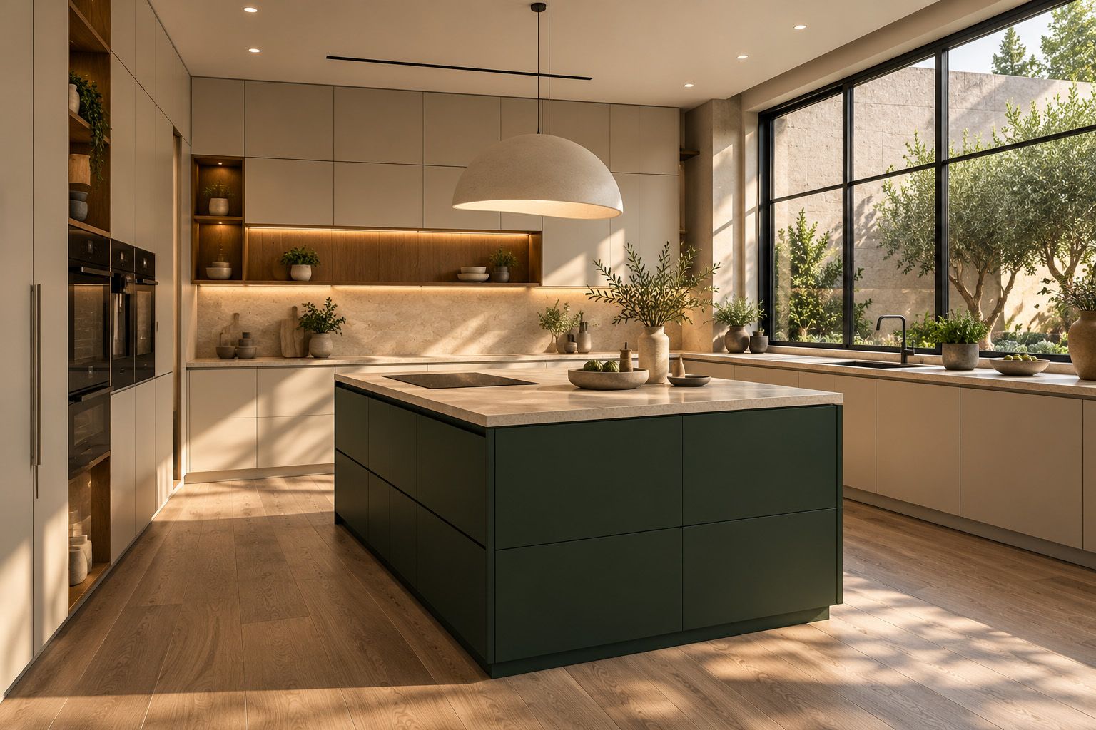
- On a bank of tall cabinets, paired with warm, light-colored fronts.
- On a kitchen island, creating contrast with the rest of the cabinetry.
- Alongside natural wood and softly toned stone surfaces.
In smaller kitchens or spaces with limited natural light, a deep green should be distributed carefully. It does not need to cover every surface.
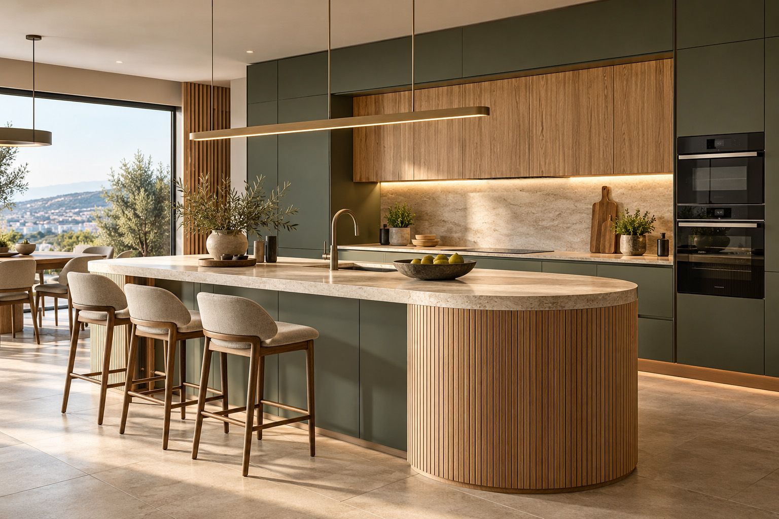
2. Grounded: Behr's Earthy Olive Green
Behr introduced Grounded T27-01 as its 2027 Color of the Year in August 2026.
This shade sits between moss green and olive, with subtle brown undertones.
In kitchen design, it offers interesting possibilities for combinations with natural materials.
Three combinations worth exploring:
- Grounded with light oak and an off-white worktop.
- Grounded with warm beige and dark metallic details.
- Grounded on a kitchen island, with the remaining cabinetry in a light neutral shade.
Balance is essential. When several different materials are used, one should take the lead while the others play a supporting role.
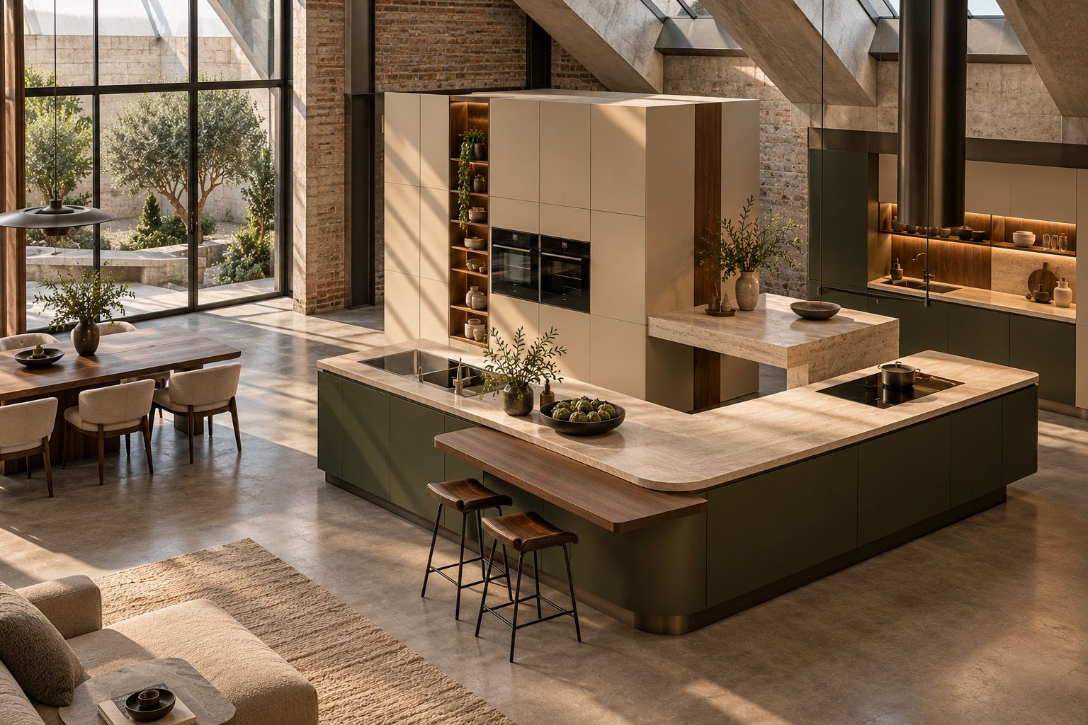
3. Country Soil: An Alternative to Classic Beige
Country Soil PPG15-30, announced by PPG as its 2027 Color of the Year, combines characteristics of beige, gray and taupe.
This color family is particularly interesting for contemporary kitchens because it can produce a calm, cohesive result without relying on pure white.
Country Soil offers a useful starting point for combinations such as:
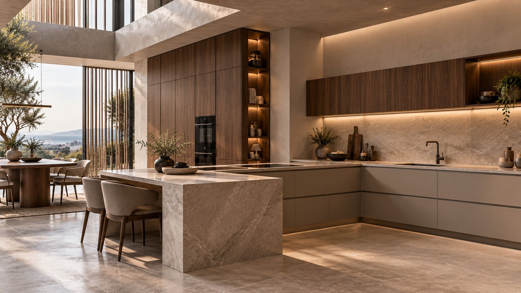
- Warm beige with walnut.
- Greige with natural-toned stone.
- Light earthy cabinet fronts with a darker group of tall cabinets.
The goal is not to reproduce the exact shade seen in a photograph, but to find the right tone for the actual space.
4. What Did Italian Kitchen Brands Present at EuroCucina 2026?
Official Colors of the Year offer useful inspiration, but the Italian market gives us a more complete picture of the material and color combinations shaping contemporary design.
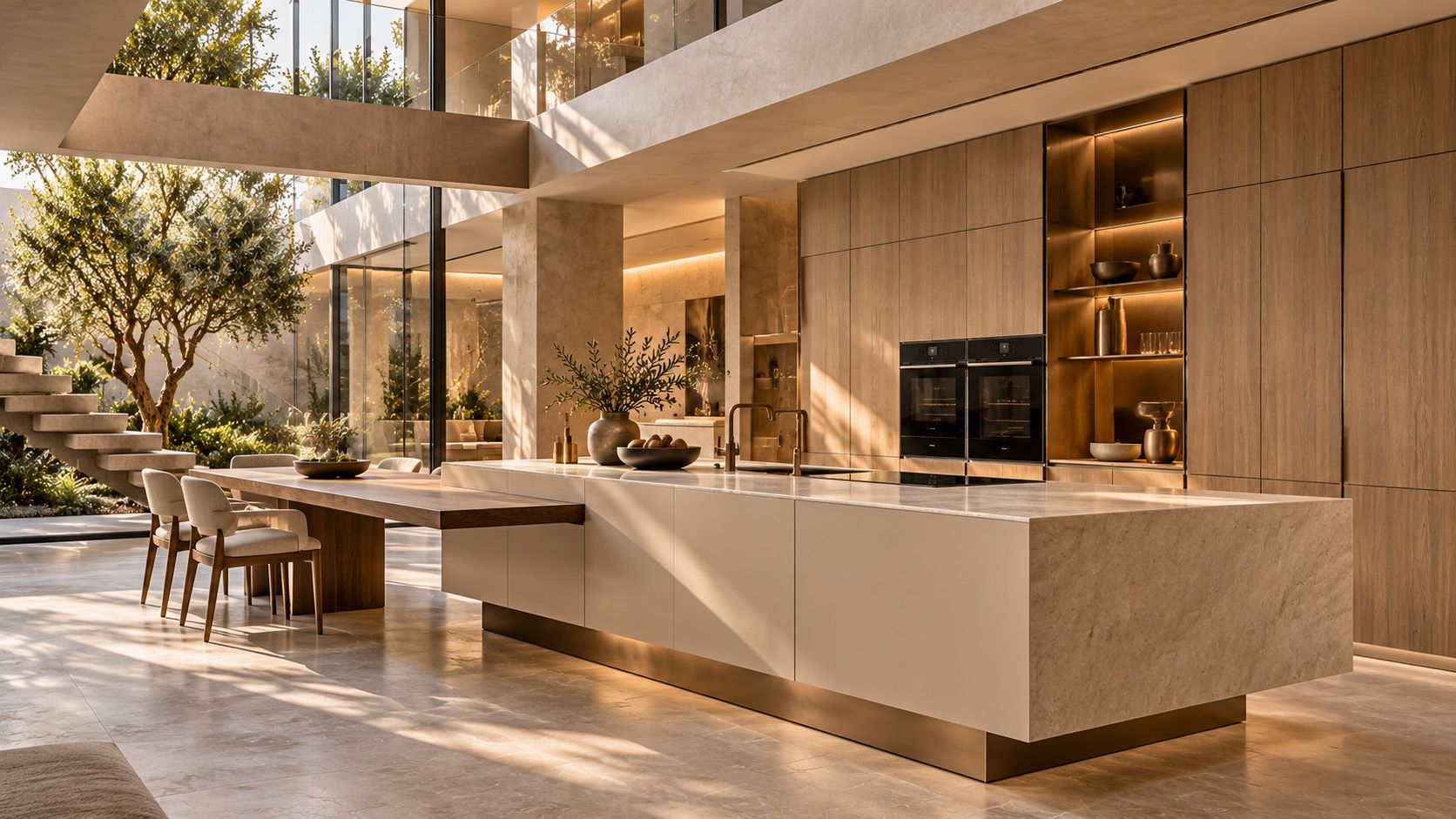
At EuroCucina 2026, Scavolini presented its Flair collection, featuring finishes such as Cream Porcelain, Emmer Oak and Microdecor Pearl Bronze.
These finishes combine soft neutrals, wood and deeper metallic tones.
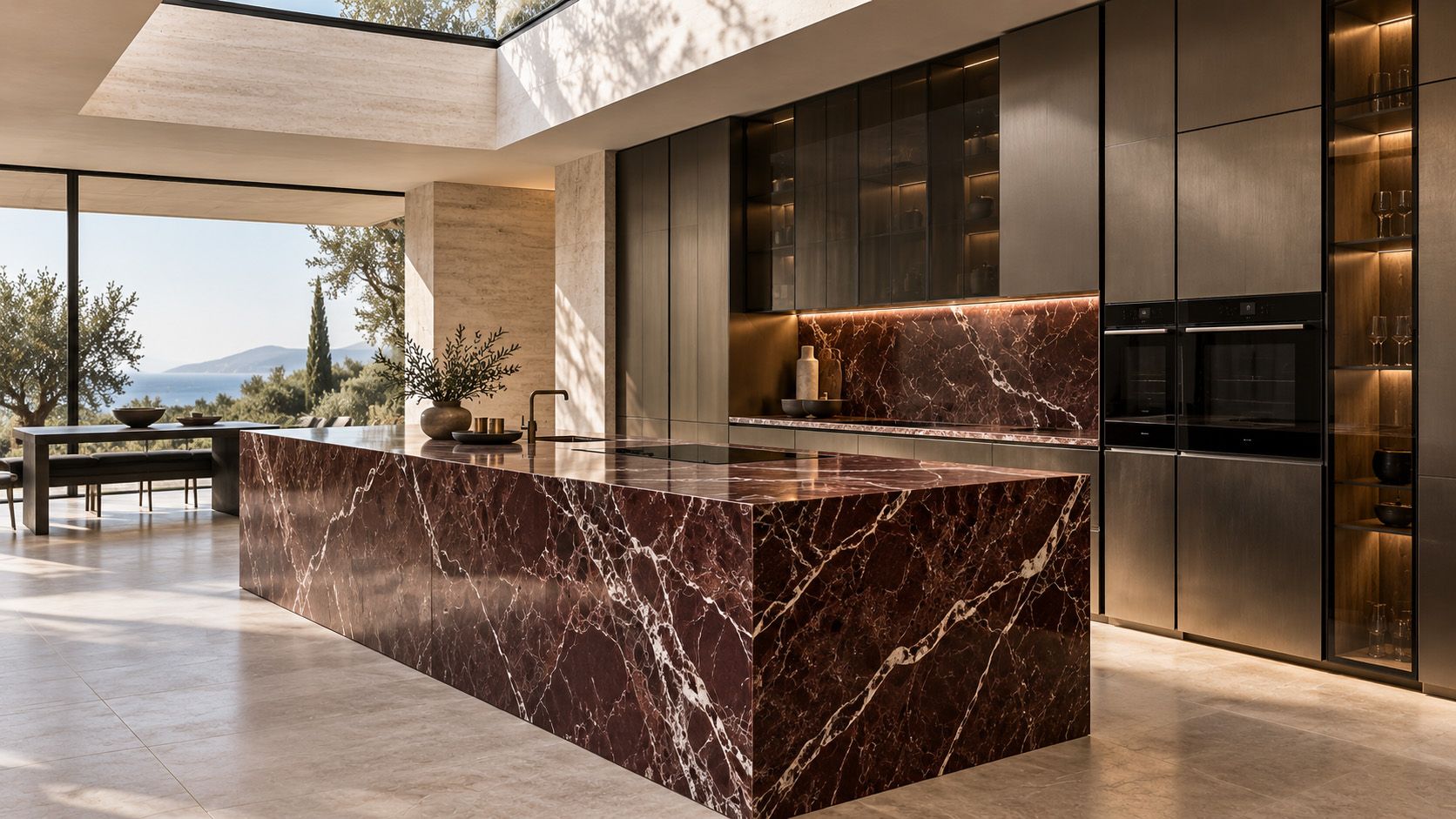
Meanwhile, Binova presented Bluna Tech Alluminio, combining a burnished aluminum appearance with distinctive Rosso Levanto natural stone.
These examples show that color is not considered in isolation. It is connected to texture, material and the overall architectural composition of the kitchen.
Perhaps the most useful lesson from the Italian presentations is this: choosing a kitchen color is part of designing a complete composition, not simply selecting a shade for the cabinets.
5. Five Color Combinations for Modern Kitchens in 2027
To translate international trends into practical choices, we have selected five color combinations that can be considered when designing a contemporary kitchen.
- Deep green, light oak and off-white: A natural, balanced combination in which wood adds warmth and off-white maintains brightness.
- Olive green, warm beige and black details: A contemporary, understated composition with carefully controlled contrasts.
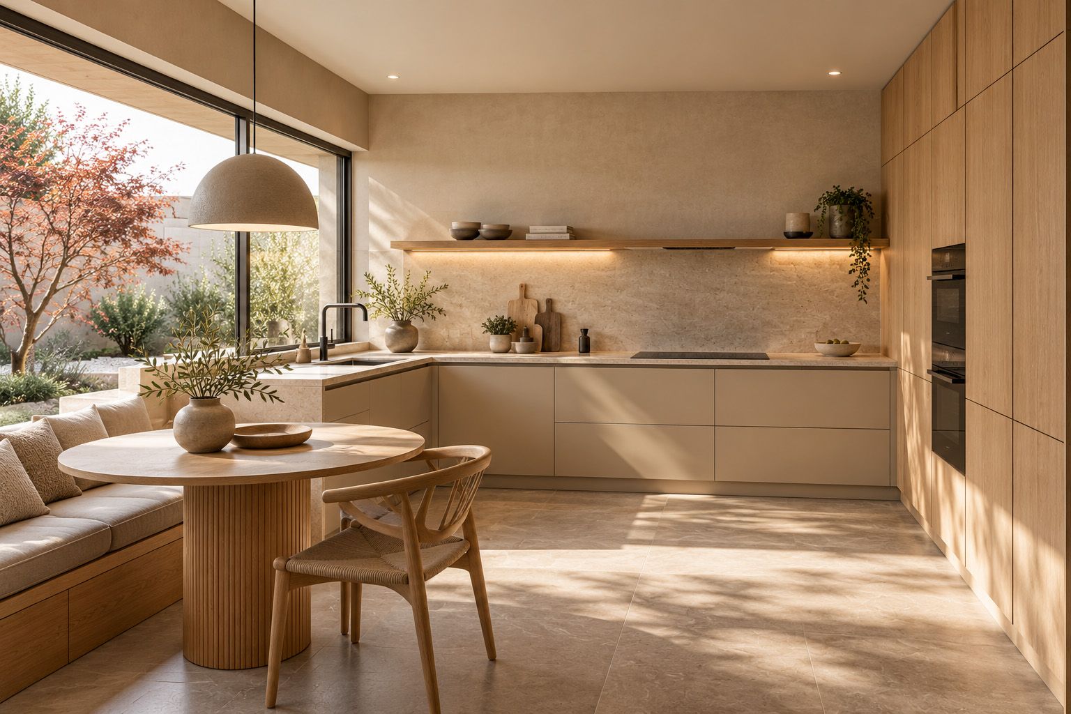
- Greige, walnut and stone: A warm, timeless choice that brings together natural textures and subtle color tones.
- Cream, natural wood and bronze details: A refined combination influenced by contemporary Italian design.
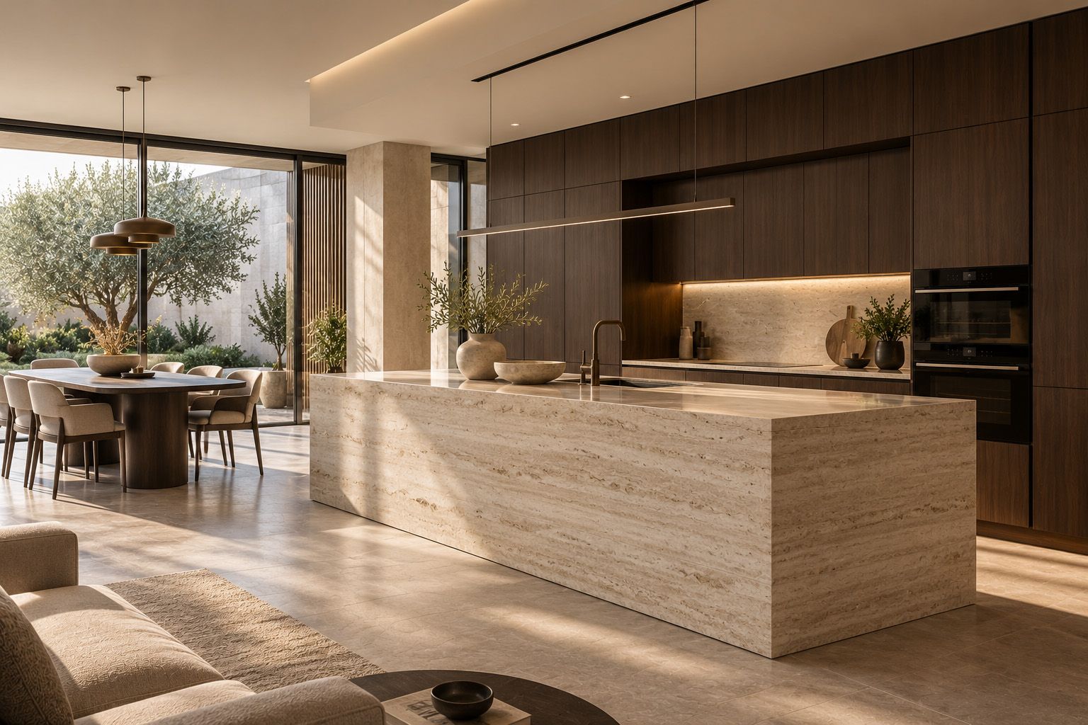
- Dark brown, light stone and soft beige: A stronger contrast, balanced by a lighter base that softens the darker surfaces.
These combinations are design suggestions, not official predictions about which colors will dominate the Greek market. The final selection should reflect the dimensions, lighting and materials of each project.
6. How to Choose the Right Kitchen Colors
Before making a final decision, three factors deserve particular attention.
Natural and artificial lighting: The same color can look different in the morning and evening. Under-cabinet lighting and lighting above an island also influence how shades are perceived.
Surfaces and textures: A matte finish, a glossy front and natural wood veneer create different visual effects, even when their colors are similar.
Relationship with the rest of the home: When the kitchen connects to the living area, the color palette should create continuity rather than competing visual compositions.
The final selection requires physical material samples. Screens and digital visualizations cannot fully replace evaluating materials under real lighting conditions.
7. The Mebel Arts Approach: Color as Part of the Design
At Mebel Arts, color selection is not treated separately from furniture design and the architecture of the space.
The Any-Size approach to customized manufacturing, within the technical limits of available materials, allows different cabinet groups to be designed with tailored dimensions, materials and finishes.
This means a particular color can be used strategically on an island, tall cabinetry or a distinctive architectural element.
New trends provide inspiration, but the final solution is determined by the client's actual needs and the technical possibilities of construction.
Conclusion: Which Kitchen Colors Are Worth Choosing for 2027?
The 2027 announcements suggest growing interest in natural greens, warm beige and layered earthy shades. Italian manufacturers add another dimension by combining color with the character of wood, stone and metal.
The most successful result does not come from blindly following a trend, but from choosing a palette that suits the space and remains enjoyable in everyday use.
For a broader look at this year's developments, read Modern Kitchens 2027: Milan Design Trends and the Future of Kitchen Design.
Explore the modern kitchens by Mebel Arts and discover our possibilities for bespoke design and Greek manufacturing.
Sources
Research: October 2026. The color combinations discussed by Mebel Arts are design suggestions, not official forecasts issued by the paint manufacturers.